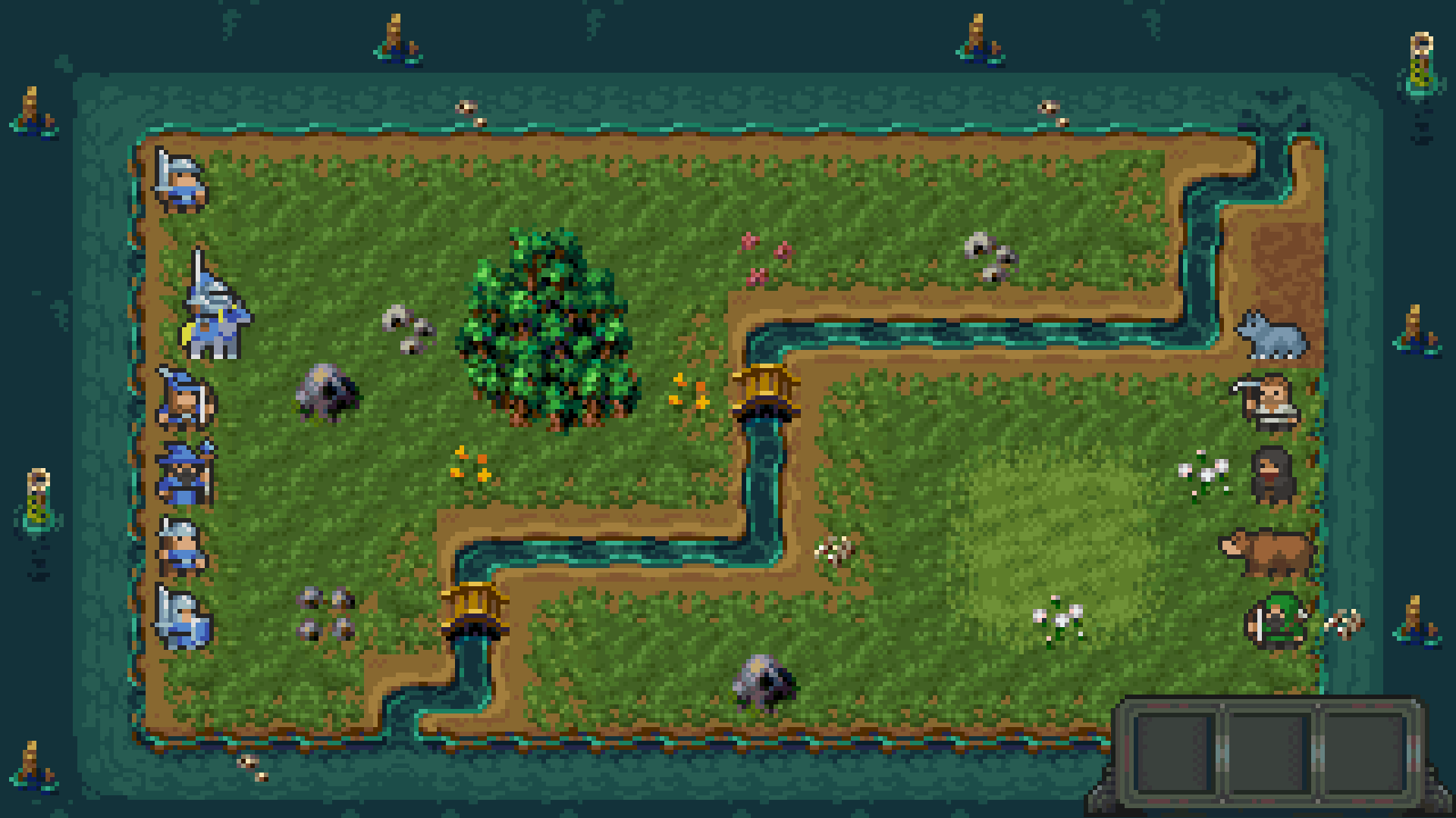
Hi! Reducing the image might partially damage it. Larger objects, like the cards, could handle scaling better, but I honestly wouldn’t recommend shrinking it. Keep in mind that the image is built with a pixel-per-pixel (1:1) ratio: if you reduce it, some pixels would physically disappear, distorting the design and making it lose its meaning. I hope I’ve explained this clearly!
Yes, thank you! That was very clear. I've chosen 16x16 assets and scaled them up by 6. However, every UI element I add looks too large because I scale them by 6 as well to ensure all pixels are the same size. I don't know what to do.
I understand perfectly what you're describing, including the unpleasant visual effect you mentioned. To solve the issue, some minor editing work in Photoshop would be necessary. However, explaining the process here is complicated, especially since I would need to ask you additional questions to better understand the situation. I saw the image you sent me, but it's too small, and I can't properly assess the pixel-perfect details. Could you send me a close-up of the UI detail compared to the background?
← Return to asset pack
Comments
Log in with itch.io to leave a comment.
Love it
Thank you!
THANK You!! This will work marvelously for my metroidvania! Kudos!
Thanks to you! I'm curious to see :)
Hello! Do you think it will scale well to 16x16, or will anything be ruined?
Hi! Reducing the image might partially damage it. Larger objects, like the cards, could handle scaling better, but I honestly wouldn’t recommend shrinking it. Keep in mind that the image is built with a pixel-per-pixel (1:1) ratio: if you reduce it, some pixels would physically disappear, distorting the design and making it lose its meaning. I hope I’ve explained this clearly!
Yes, thank you! That was very clear. I've chosen 16x16 assets and scaled them up by 6. However, every UI element I add looks too large because I scale them by 6 as well to ensure all pixels are the same size. I don't know what to do.
The two sources you are trying to equate originally both have a 1:1 ratio?
Can you post an image here so we can see exactly what it's about?
The UI elements are too large compared to the rest of the image. However, if I reduce their size by half, the pixels look strange and inconsistent.
I understand perfectly what you're describing, including the unpleasant visual effect you mentioned. To solve the issue, some minor editing work in Photoshop would be necessary. However, explaining the process here is complicated, especially since I would need to ask you additional questions to better understand the situation. I saw the image you sent me, but it's too small, and I can't properly assess the pixel-perfect details. Could you send me a close-up of the UI detail compared to the background?